Introduction
Technical analysis is a trading discipline employed to evaluate investments and identify buying or selling opportunities by analyzing statistical trends gathered from trading activity, most commonly price and volume. Unlike fundamental analysis which focuses on the underlying business, technical analysis looks at price/volume histories aiming to forecast future price behavior based on what has occurred in the past.
Technical analysts operate under the assumption that current prices already fully reflect all known fundamentals, and asset price fluctuations going forward will continue to follow recognizable chart patterns signaling bullish or bearish market structure shifts. By being able to decipher charts and indicators signaling recurring shifts, traders can aim to enter/exit at opportune points. This guide covers the core aspects of reading crypto charts, using trading indicators and identifying candlestick patterns to equip absolute beginners with essential technical skills for actively trading digital assets.
Reading Crypto Charts
Candlestick Charts
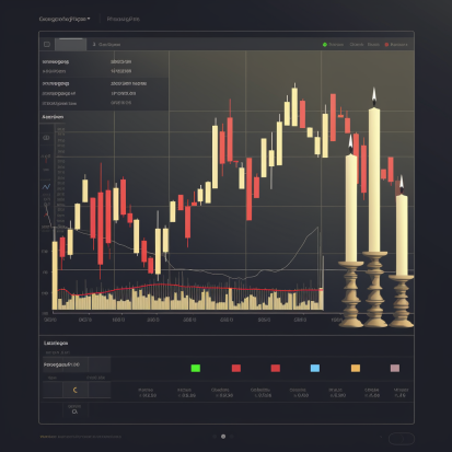
The most common type of chart crypto traders use is a Japanese candlestick chart, which shows price on the vertical axis evolving over time depicted horizontally. Unlike simpler line charts just plotting closing prices, candlestick charts provide more visible insights through rectangles (“candles”) with extended wicks showing intra-period volatility. The rectangle body drawn between the open and close depicts the price spread for that period (ex: 1 minute, 1 week) with colors indicating bullishness (green/white) or bearishness (red/black) based on close being higher or lower than the open price.
Granularity
Charts can represent pricing activity across diverse timeframes with intraday, daily, weekly being common. Higher granularity charts of smaller time units (e.g. 1-minute), display more fine-grained price details but can seem noisy lacking clear directional bias. Whereas wider horizon charts (e.g. monthly) provide smoother trend perspective hiding inner volatility. Multi-timeframe analysis taking into account likely scenarios across differing chart scopes can enhance clarity.
Volume
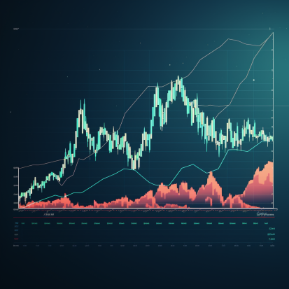
Volume shown as vertical bars under the price candles indicates total trading activity or number of coins exchanged during that period. Spikes suggest increased participation often foreshadowing price breakouts providing clues on likely momentum sustainability or reversals at extremes. Volume combined with candle signals paint a fuller picture.
Applying Trading Indicators
While candlestick patterns themselves can indicate instances of overextension needing correction or confirm trend biases offering trade timing guidance, using technical indicators can help traders spot crucial moments through mathematically computed signals derived from historic price and volume. Myriad indicators exist but below are 5 popular beginner options.
Moving Averages (MA)
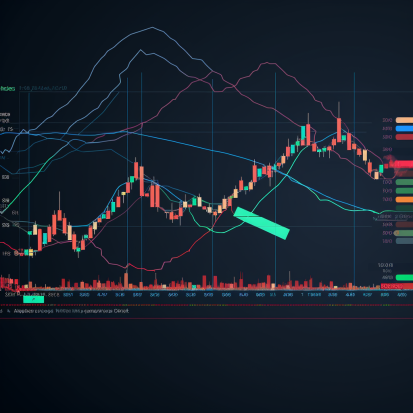
A moving average plots the average price across a set lookback period and shifts along the time axis as new periods emerge. Comparing with current spot indicates trend directionality and tests as dynamic support/resistance. Example: 50-day MA shows average of last 50 days. Rise above signals bullish breakout from range; tests below suggest bearish reversals.
Relative Strength Index (RSI)
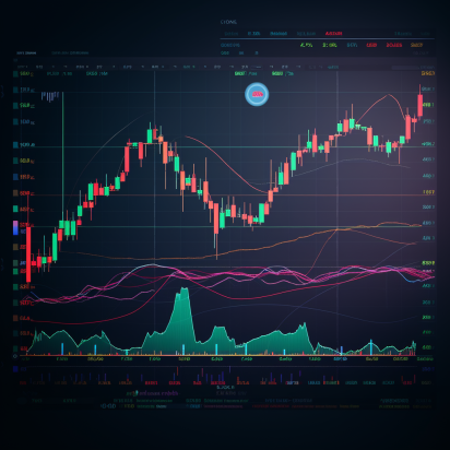
RSI measures if recent gains outweigh losses to indicate overbought (70) or oversold (30) conditions helpful for anticipating mean reversions or assessing price extremes. Works well combined with MAs.
Bollinger Bands (BB)
BBs plot price envelopes reflecting one standard deviation above/below a simple moving average line. Band squeezes precede breakouts while tests of outer bands signal likely reversions. Adaptive envelopes make BBs great for visualizing volatility.
MACD (Moving Average Convergence Divergence)
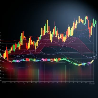
MACD evaluates moving average momentum by subtracting 26-period and 12-period EMAs to generate signals (blue line) then statistically smoothed further with another 9-period MA as the signal line (orange). Crossovers anticipate acceleration changes in ongoing trends.
Fibonacci Retracements
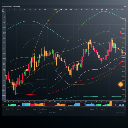
Fib ratios mathematically represent mid pullback resting points in ongoing bullish/bearish swings. Especially the 61.8%, 50% and 38.2% levels act as support/resistance during corrections before trends potentially resume.
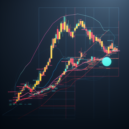
Traders use these indicators individually or stacked as combos to confirm pattern probabilities and time entries/exits leveraging statistical tendencies rather than just guesswork.
Reading Candlestick Patterns
While indicators derive from mathematical computations, candlestick patterns are visual chart formations signifying likely trend continuations or reversals that technicians can recognize through classical formations catalogued extensively for Japanese rice traders centuries ago and still applicable due to underlying emotions of fear, uncertainty and greed affecting all markets universally.
Here are 5 common reversal and continuation patterns useful even for beginner chartists:
Double Tops/Bottoms
Two failed tests of equal highs/lows followed by bearish/bullish engulfing candles often signal important trend reversals as prior indecision gets resolved decisively following the classic pattern.
Bull/Bear Flags
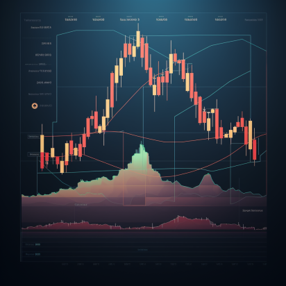
Tight sideways channel consolidating after impulsive move hints likely resumption in primary direction once upper/lower channel lines break forecasting minimal target measuring initial spike height projected upwards.
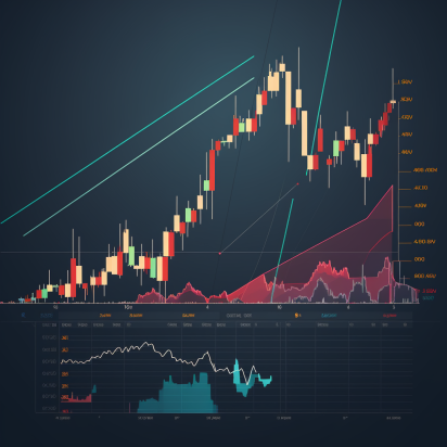
Cup and Handle
Bowl-shaped consolidation clarifying interim support/resistance levels hints likely upside breakout on decisive escape offering favorable risk/reward long entries mirroring the intuitive shape.
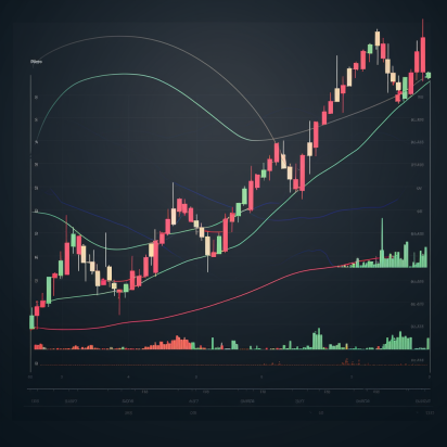
Ascending/Descending Triangles
Horizontal lines with series of higher lows/lower highs compressing into a narrowing range presages eventual breakout with triangles over 70% accurate forecasting directionality and profit targets based on base width projected from break point.
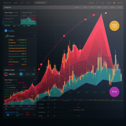
Head and Shoulders Top/Bottom
Benchmark reversal patterns comprised of three alternating peaks/troughs with the outer ones (shoulders) lower/higher than the middle (head) indicates definitive trend exhaustion as neckline support/resistance breaks.
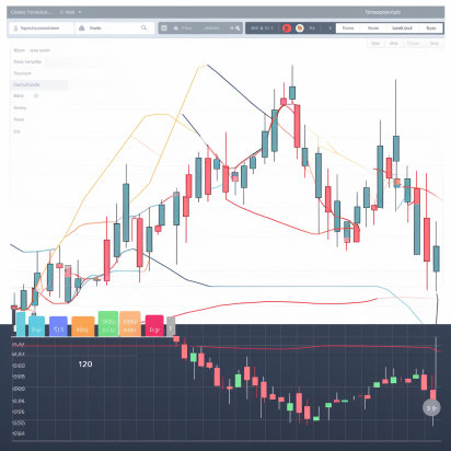
As evident, most candlestick chart patterns elegantly communicate likely interim supply/demand dynamics, offering advanced warning for directionality edge. Practiced chart readers can buildconviction knowing historical tendencies likely to rhyme again!
Conclusion
Like recognizing recurring geometrical shapes, being able to spot technical patterns handed down through generations of traders arms market technicians with analytical skills to confidently maneuver noisy price charts and statistics. Candlesticks illustrate the emotional balance between buyers and sellers. Indicators diagnose momentum mathematically counterbalancing raw price signals. Together they form multidimensional lenses into the likely futures those before us already lived enlightening forward paths for those willing to read truly!


